I created a design system to support the efficient modernization of 70+ enterprise applications.
The design system was intentionally built to support the unique business needs of each application while maintaining a consistent user experience across the broader enterprise suite. This enabled product teams to modernize mission critical systems more efficiently while maintaining consistency, compliance, and long-term scalability.
Scope
150+ enterprise applications assessed
Impact Area
70+ applications scheduled for modernization
Timeline
4 month discovery + phased delivery
Background
The Forest Service operates a large, complex ecosystem of enterprise applications supporting Forest Service operations. Many of these systems had not been modernized in decades, resulting in overlapping functionality, rising maintenance costs, accessibility risk, and inconsistent user experiences.
Our team set out to not only replace aging applications, but to rethink how technology could better support the Forest Service mission.
My work focused on creating the UX foundation needed to enable that transformation at scale.
Discovery
Transformative change driven by research
Before designing solutions, the team conducted a four-month discovery effort to understand the ecosystem holistically.

What we learned

Why a Design System Was Necessary
With 70+ applications slated for modernization, consistency could not be enforced one application at a time.
The design system became the mechanism to:
- Reduce redundant design and engineering work
- Establish a shared UX and implementation language
- Embed accessibility at the system level
- Enable faster, more predictable delivery across teams
Process

1. Plan & Organize
To support 70+ applications, I needed to create a design system architecture that could scale without fragmenting.
- Designed a flexible library structure
- My intent was for designers to pull a shared foundational file into their app-specific local libraries
- This was to maintain consistency while allowing room for growth depending on the needs of each individual application
- Worked closely with devleopers to establish design tokens & naming conventions

2. Assess UI Patterns
Using the atomic design framework, I generated a list of atoms, molecules, and organisms that would support the baseline functionality established in my team's earlier discovery work. I then audited tools like Salesforce and Jira to understand what patterns users would already expect to see.
I facilitated sessions with clients, project managers, and developers to evaluate UI elements based on user need and implementation difficulty. Plotting these on a grid gave us a clear MVP of UI elements and a prioritized backlog to build from.
3. Establish Foundations
Key activities
Used best practices to establish the visual language of our SaaS.
- Typography:
- Sans-serif type system for modern feel and strong legibility across dense text and data tables
- Scales and hierarchy grounded in the U.S. Web Design System (USWDS)
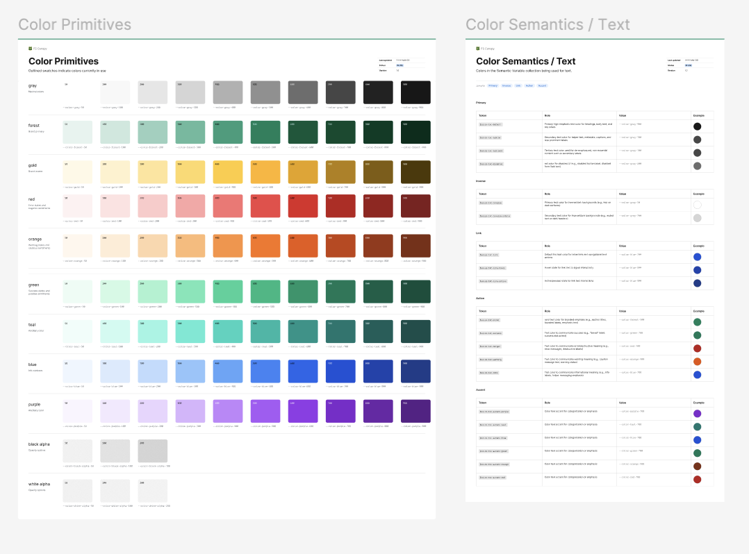
- Color:
- Extended existing Forest Service branding of earthy, muted, natural tones into a full accessible palette meeting WCAG AA contrast requirements
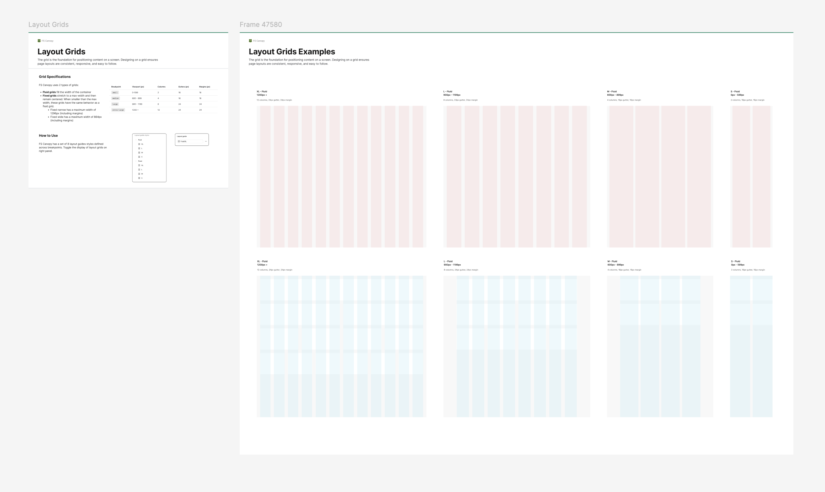
- Spacing & layout
- 8pt grid for predictable rhythm that scales cleanly

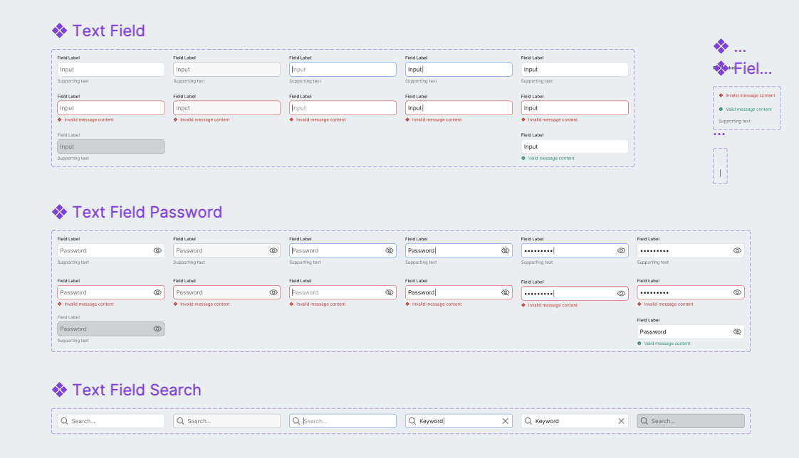
4. Build Library
Key activities
- Designed components in parallel with engineering
- Tested components for accessibility
- Refined components based on implementation feedback

5. Establish Governance
Key activities
- Started Small — In the beginning, the audience was small therefore governance was simple. We followed the prioritized backlog and created new components as real needs surfaced as we modernized the first application.
- Introduce More Structure — As the team and the number of applications we were modernizing grew, we introduced bi-weekly reviews to discuss the design system. In these sessions, designers reviewed components built in our local libraries to assess whether they could be abstracted and promoted into the shared system for use across other applications.
- Define Metrics — As we iterated on the design system, app modernization, and governance in parallel, we knew it was important to define metrics upfront. We wanted to track adoption and measure the real impact of the system over time rather than relying on gut feel.
- What this enabled — We used these sessions to ensure the design system stayed current with real product work rather than becoming a separate initiative that fell behind. Components were always tied to an actual use case, reducing the risk of building for hypothetical needs.
Design System in Action
The Forest Service's Grants & Agreements application was the first to modernize and put our system to the test.
The application is used to track the grants & agreements the FS makes with partner organizations and to coordinate with the financial system of record, FMMI.
Next Steps
Set up metrics to track design system success
We defined and tracked adoption, component usage, and consistency metrics across applications to measure impact and identify gaps.
Scale design system as more apps are modernized
We audited new application needs and systematically added reusable components and patterns to support expanding use cases.
Iterate on existing components as needs change
We incorporated feedback from managers, field crews, and partners to refine components and improve usability and data capture.